Product pages for Bistrohunter

Design product pages for a restaurant finder

Role

UX/UI Designer

Industry

Food

Year

2024

Introduction

Bistrohunter is a restaurant recommendation platform, and for this project, we needed to create dedicated pages for the recommended restaurants. The goal was to enhance the user experience by providing detailed restaurant information through our website, making it easier to convert recommendations into reservations.

Customers access these pages via a link that takes them directly to the recommended restaurants. These pages had to include key details such as restaurant features, photos of the food and venue, ratings, and location.

Research

Before designing the pages, we conducted two key research approaches:

  • Benchmarking: We analyzed how other companies in the industry or competitors presented information on their product pages. We examined which data points were highlighted and how the content was visually structured.

  • User Interviews: To understand which factors influence restaurant selection the most, we conducted interviews where we identified the most valued criteria, such as price, location, food photos, and ratings.

Data Structuring

Based on our research findings, the next step was to define what information to include on each restaurant page. We cross-referenced user preferences with the available data in our database to establish a clear structure.

We focused on presenting data in an organized and hierarchical manner, emphasizing the most relevant aspects first, such as cuisine type or price, while placing secondary details like dietary options in dedicated sections. We also defined key actions users could take from these pages, including making a reservation, sharing the restaurant, or requesting new recommendations.

references
references
references
benchmark
benchmark
benchmark

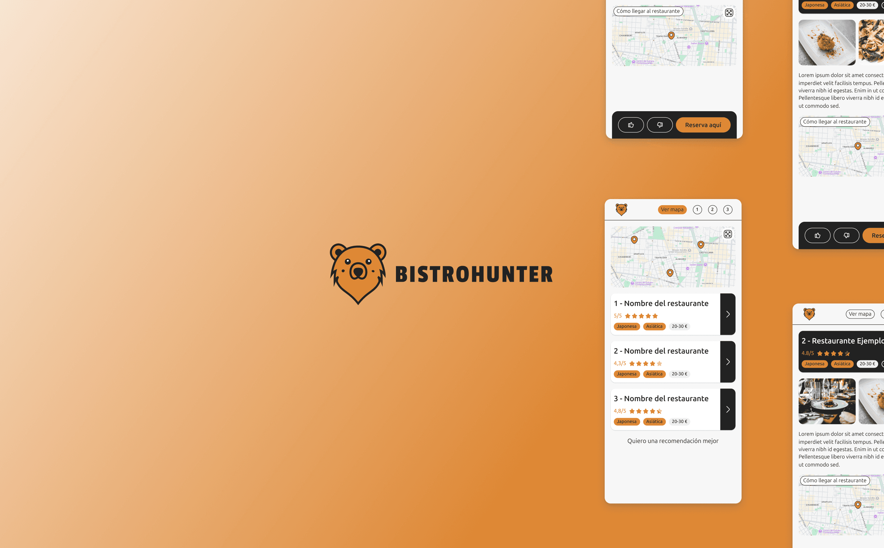
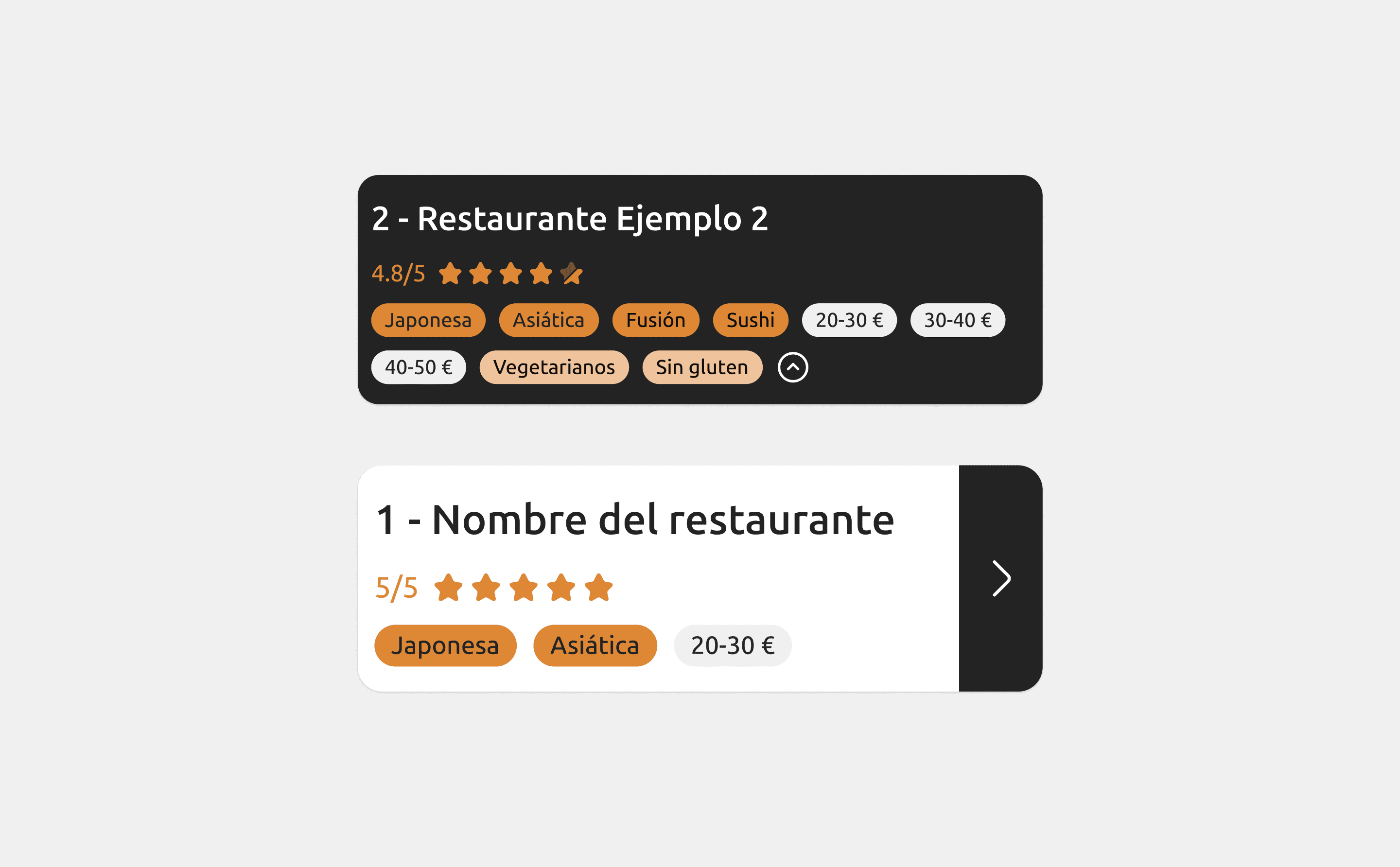
Wireframes and High-Fidelity Prototyping

We started with hand-drawn sketches to visualize the placement of each information element. Gradually, the prototype took shape with wireframes, where we experimented with different layouts to optimize information display.

Once we defined a functional structure, we moved on to high-fidelity design while adhering to brand guidelines. Thanks to a previously developed UI Kit, we streamlined the process, ensuring visual consistency and optimizing design time.

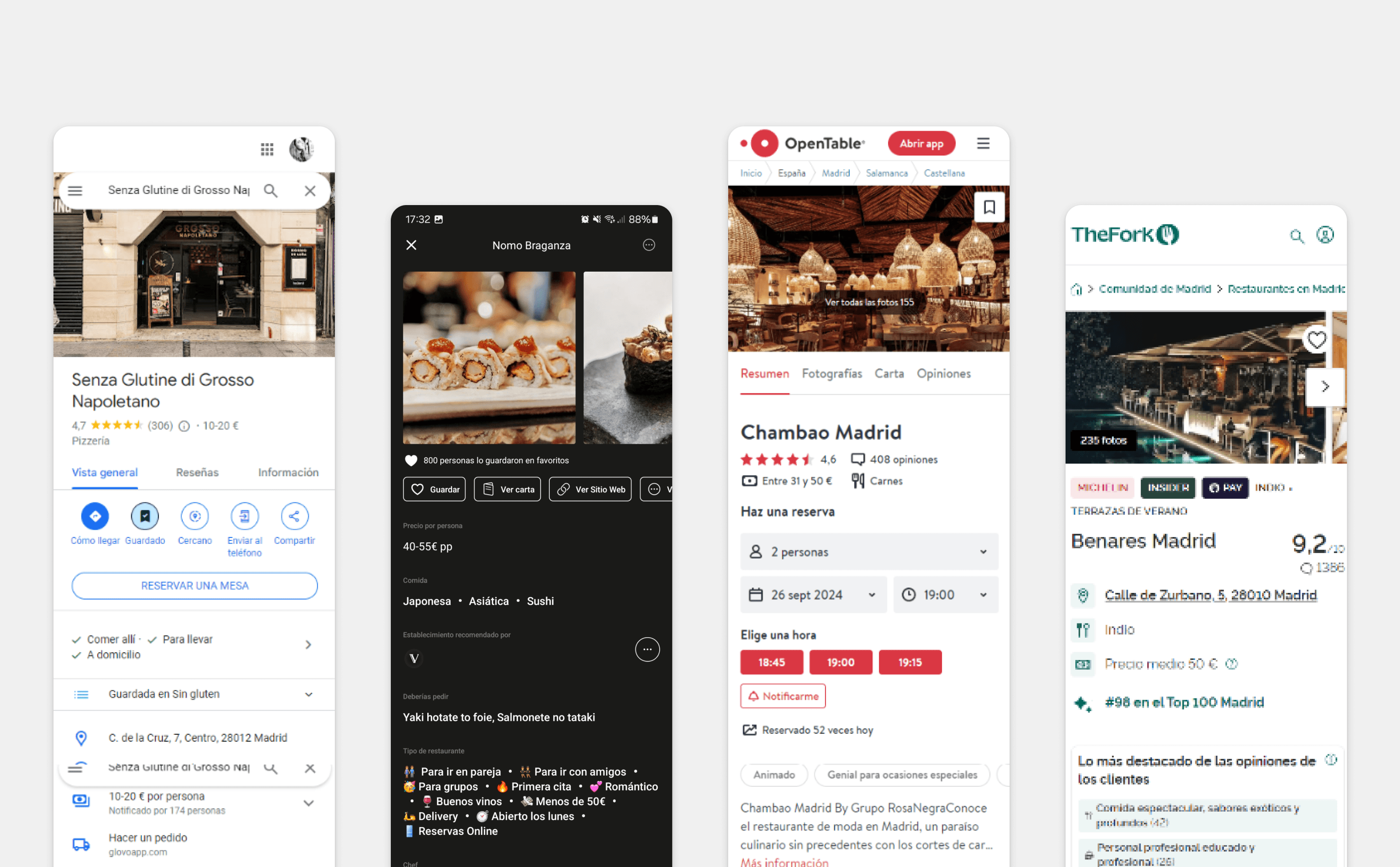
No-Code Implementation and Metrics

To ensure speed and flexibility, we implemented this project using No-Code tools. This allowed us to conduct rapid experiments and adjustments without relying on the development team, significantly improving iteration time.

Once live, we analyzed various metrics to evaluate the pages' performance. We tracked traffic from WhatsApp, conversion rates into reservations, and user behavior on the page (time spent, CTA clicks, etc.). These insights helped us identify opportunities for improvement and plan future experiments to further enhance the experience.

wireframes
wireframes
wireframes
components
components
components
prototype
prototype
prototype

Conclusions and Learnings

The key takeaways from this project are:

  • A complex development is not always necessary to validate an idea and generate impact.

  • Information hierarchy is crucial when handling multiple data points—a clear structure improves usability and conversion.

  • Implementing No-Code solutions enables quick and efficient iterations, facilitating continuous product optimization.

Other projects